The universe is the color of weak coffee
In 2002 two astronomers at Johns Hopkins University, Karl Glazebrook and Ivan Baldry, averaged the light of more than 200,000 galaxies and first announced that the collective color of the universe was a pale turquoise. Within weeks they took it back. A mistake in their color software had skewed the result, and the corrected answer was a milky off-white that the public soon nicknamed cosmic latte.
The color was never the point of the research. It started as a footnote to a serious survey of the light galaxies give off, and it became, briefly, one of the most talked-about findings in astronomy. Newspapers ran with the idea that the cosmos had a single average shade, and home decorators took an interest in a color drawn from every galaxy at once. The retraction, when it came, was almost as widely reported as the original claim.
How you average the color of the universe
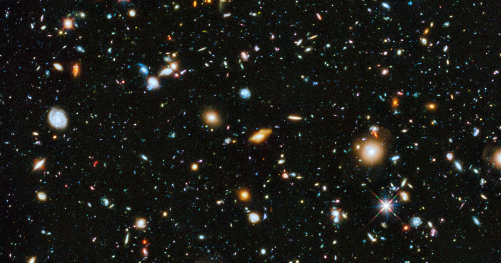
The two were studying the cosmic spectrum, built from the Australian Two-degree Field Galaxy Redshift Survey, which had measured the spectra of more than 200,000 galaxies. By combining many tens of thousands of those spectra, they produced a single volume-averaged, luminosity-weighted result, in effect the average color of light emitted by the nearby universe. Their real aim was to read the history of star formation out of that combined light, since young blue stars and old red stars leave different fingerprints in it.
That blend is why the spectrum landed where it did. It is a mixture of young, hot, blue populations and old, cool, red ones, and the average of the two is neither strongly blue nor strongly red. The paper noted that the resulting color is not the kind a single glowing object would produce, which was the first hint that turning a spectrum into a single perceived shade is less straightforward than it sounds.
On a whim, Glazebrook decided to work out what that spectrum would look like to a human eye, using the standard color-matching functions that describe how people perceive different wavelengths. Integrating the cosmic spectrum through those functions returned a blue-green that the team announced as “a few percent greener than pale turquoise.” Announced at a January 2002 meeting, the idea that the universe had an average color, and that the color was greenish, caught the public imagination at once.
The white-point mistake
Not long after the turquoise claim made news, Mark Fairchild of the Munsell Color Science Laboratory at the Rochester Institute of Technology got in touch. Fairchild had, almost literally, written the book on the subject, the 1998 text “Color Appearance Models.” He and his colleagues found that the free software the astronomers had used had set its “white point” incorrectly. The white point is the light that the eye treats as plain white, and it shifts with surroundings, a little yellow under household bulbs, a little blue on some screens. The wrong setting had tinted the whole result green.
A color scientist at the same laboratory, Francis Imai, put the problem in everyday terms. “Tungsten lights, for example, can make the white point a little bit yellowish,” he explained. “Some monitors have a bluish white point. Your visual system tries to adapt, so that you assume that color is white, but it’s actually yellowish or bluish.” The freeware had effectively chosen the wrong reference for white, and the error pulled the whole result toward green.
When the white point was fixed for someone viewing the light in a dark room, the color came out beige. Adjusted for daylight it turned faintly red, and for indoor lighting it shifted blue. Baldry made the dependence vivid: “if you look at all the light in the universe from a room that has a red neon light, then it may appear turquoise,” he said. “But that’s not a standard perspective.”
Glazebrook did not hide from the mistake. “It’s our fault for not taking the color science seriously enough,” he said. “I’m very embarrassed. I don’t like being wrong, but once I found out I was, I knew I had to get the word out.”
The astronomers posted their spectrum data online and invited anyone to recompute the color. From a flurry of suggested names, cosmic latte stuck, chosen for the milky off-white shade.
What the color actually means
The “color of the universe” is not a property of space the way temperature or density is. It is a perceptual quantity, and the turquoise blunder showed exactly why that matters: the same spectrum reads as beige, red or blue depending only on the lighting you imagine yourself standing in. There is no neutral place to view all the galaxies from, so there is no single true color, only a color for a stated set of assumptions.
It is also an average, luminosity-weighted across one survey’s galaxies at modest distances, not a tally of every photon the cosmos has ever released. The galaxies in the 2dF sample are relatively nearby in cosmic terms, so the figure describes the light of the present-day universe rather than the redder glow of its distant, earlier reaches. And it was, by the authors’ own account, a lighthearted aside to a paper about how fast stars have formed across cosmic time. The beige is real enough, but it describes a calculation and a convention, not a wall you could paint to match the sky.
The naming, too, was informal. Cosmic latte was a popular choice rather than a scientific term, and it appears in galleries of color values more often than in the astronomical literature.
A beige worth keeping
What lingers is less the color than the correction. Two researchers made a vivid, widely repeated claim, learned within weeks that they had got it wrong, and said so in plain language rather than letting the prettier answer stand.
The universe, averaged and viewed in the dark, is roughly the color of milky coffee. The more durable lesson is in how quickly that beige replaced the turquoise once someone checked the color science.